Wednesday 7 December 2011

Reading AfriPop data

The AfriPop project aims to produce high-resolution population density estimates for Africa. This could be very useful for some of our spatial epi projects. So I thought I'd have a look.

Their methods for computing population are explained. I can't find any licensing or usage restrictions on the data, so I'll have to clear that up before doing anything serious with it. Let's download something and read it in.

The download form asks for a few details, but there's no email check (or 'I have read your terms and conditions' checkbox) so fill in as honestly as your conscience requires. You'll get a zip file to download.

When unzipped you'll have three files. For Benin these are called apben10v3 with extensions hdr, flt and prj.


The flt file is the data, the hdr is header info, and prj is projection info. Use gdalinfo to get a summary - run it on the flt file:


$ gdalinfo apben10v3.flt 
Driver: EHdr/ESRI .hdr Labelled
Files: apben10v3.flt
       apben10v3.hdr
       apben10v3.prj

[WGS84 coordinate system info here]

Origin = (0.773989957311480,12.409206711176100)
Pixel Size = (0.000833300000000,-0.000833300000000)
Corner Coordinates:
Upper Left (0.7739900,12.4092067) (0d46'26.36"E,12d24'33.14"N)
Lower Left  (0.7739900,6.2252874) (0d46'26.36"E,6d13'31.03"N)
Upper Right (3.8522002,12.4092067)(3d51' 7.92"E,12d24'33.14"N)
Lower Right (3.8522002,6.2252874) (3d51' 7.92"E,6d13'31.03"N)
Center      (2.3130951,9.3172471) (2d18'47.14"E,  9d19' 2.09"N)
Band 1 Block=3694x1 Type=Byte, ColorInterp=Undefined
  NoData Value=-9999

All pretty good. A standard ESRI file (except there's often nothing really standard about ESRI file formats). Let's read it and plot it using the raster package:

> bpop=raster("./apben10v3.flt")
> image(bpop)


Oh dear. Reading the docs about these files tells me that sometimes gdal just doesn't get it right. It said "Type=Byte", but the file is 109652696 bytes long, which is exactly 7421x3694x4 bytes. These are 4 byte values. In fact the AfriPop page says these files are "ESRI Float". Luckily there's an easy way to persuade gdal these are floats. Open up the hdr file (NOT the flt file. Don't open the flt file!) in a text editor (emacs, vi, notepad++, notepad) and add:

 pixeltype float

to the items. Then try again:

> bpop=raster("./apben10v3.flt")
> plot(bpop,asp=1)


Looks good. Note we can get away with asp=1 since we're close to the equator. Or we can give it a projection:

 projection(bpop)="+proj=tmerc"
 plot(bpop)

and that's just as good. We can also zoom in using the very nifty zoom function from the raster package:

 and inspect the data further.

Note that the raster package does a really good job of dealing with large rasters. When plotting these things it is sampling the raster file so not all of it is read into memory. I don't have a monitor capable of showing 7000x3000 pixels (yet) so raster just grabs enough to look good. But if you try and do anything with this size of raster, you will strangle your machine and it may die. Don't do this:


plot(log(bpop))

for example. Let's sample our raster down a bit for some more exploring. First I need to restart R after the last line crashed out. I'll sample down to something of the order of a few hundred pixels by a few hundred pixels by specifying the size as 500*500 - sampleRegular will work out the exact resolution, keeping the aspect ratio. It's smart like that:

> library(raster)
> bpop=raster("apben10v3.flt")
> projection(bpop)="+proj=tmerc"
> plot(bpop)
> bpop2 = sampleRegular(bpop, 500*500, asRaster=TRUE)
> bpop2
class       : RasterLayer 
dimensions  : 708, 352, 249216  (nrow, ncol, ncell)
resolution  : 0.008744915, 0.008734349  (x, y)
extent      : 0.77399, 3.8522, 6.225287, 12.40921  (xmin, xmax, ymin, ymax)
coord. ref. : +proj=tmerc +ellps=WGS84 
values      : in memory
min value   : 0 
max value   : 336.4539 

> plot(bpop2)
> plot(log(bpop2))

[Perhaps we should use 'resample' here?] Now the log plot is doable:


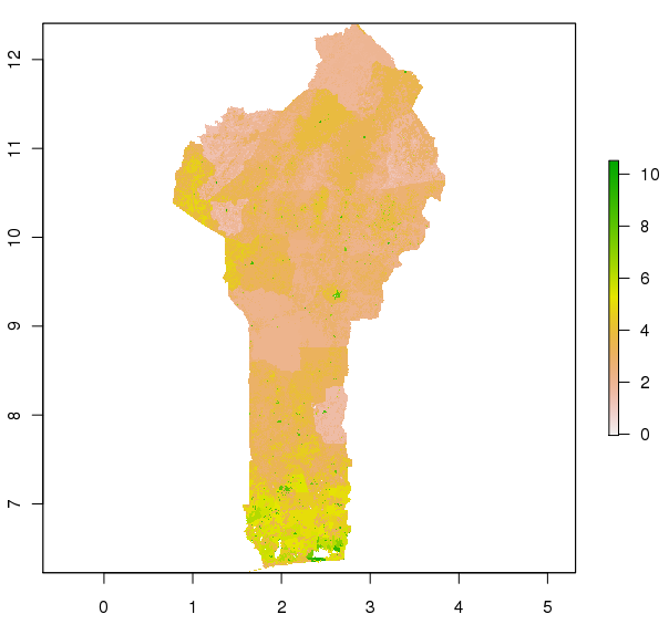
BUT these values are now wrong. The units of the original data are persons per grid square. Our grid squares are now bigger then the original grid squares, so more people live in them. We can correct this by scaling by the ratio of the cell sizes:

> bpop2= bpop2 * prod(res(bpop2))/prod(res(bpop))
> plot(log(bpop2))

and now we get a more correct map:

I'm not sure how 'correct' or optimal this is of downsampling population density grids is - for example the total population (sum of grid cells) will be slightly different. Perhaps it is better to rescale the sampled grid to keep the total population the same? Thoughts and musings in comments for discussion please!

Tuesday 18 October 2011

optifix - optim with fixed values

So you've written your objective function, fr, and want to optimise it over the two parameters. Fire up optim and away you go:

> fr <- function(x) {   ## Rosenbrock Banana function
     x1 <- x[1]
     x2 <- x[2]
     100 * (x2 - x1 * x1)^2 + (1 - x1)^2
 }

> optim(c(-1.2,1), fr)[c("par","value")]
$par
[1] 1.000260 1.000506

$value
[1] 8.825241e-08

Great. But sometimes you only want to optimise over some of your parameters, keeping the others fixed. Let's consider optimising the banana function for x2=0.3

>  fr <- function(x) {   ## Rosenbrock Banana function
         x1 <- x[1]
         x2 <- 0.3
         100 * (x2 - x1 * x1)^2 + (1 - x1)^2
     }

> optim(-1.2, fr,method="BFGS")[c("par","value")]
$par
[1] -0.5344572

$value
[1] 2.375167

(R gripes about doing 1-d optimisation with Nelder-Mead, so I switch to BFGS)

Okay, but we had to write a new objective function with 0.3 coded into it. Now repeat for a number of values. That's a pain.

The conventional solution would be to make x2 an extra parameter of fr:

>  fr <- function(x,x2) {
         x1 <- x[1]
         100 * (x2 - x1 * x1)^2 + (1 - x1)^2
     }

and call optim with this passed in the dot-dot-dots:

> optim(-1.2,fr,method="BFGS",x2=0.3)[c("par","value")]
$par
[1] -0.5344572

$value
[1] 2.375167

Okay great. But suppose now we want to fix x1 and optimise over x2. You're going to need another objective function. Suppose your function has twelve parameters... This is becoming a pain.

You need optifix. Go back to the original 2 parameter banana function, and do:

> optifix(c(-1.2,0.3),c(FALSE,TRUE), fr,method="BFGS")
$par
[1] -0.5344572

$value
[1] 2.375167

$counts
function gradient 
      27        9 

$convergence
[1] 0

$message
NULL

$fullpars
[1] -0.5344572  0.3000000

$fixed
[1] FALSE  TRUE

Here the function call is almost the same as the 2-parameter optimisation, except with a second argument that tells which parameters to fix - and they are fixed at the values given in the first argument. The values in that argument for non-fixed parameters are starting values for the optimiser as usual.

The output is the output from the reduced optimiser. In this case it is one parameter value, but there's also a couple of other components, $fullpars and $fixed, to tell you what the overall parameter values were and which ones were fixed.

Optifix takes your objective function and your specification of what's fixed to create a wrapper round your function that only takes the variable parameters. The wrapper inserts the fixed values in the right place and calls your original function. It then calls optim with a reduced vector of starting parameters and the wrapped objective function. Hence the wrapped function is only every called with the variable parameters, and the original function is called with the variables and the fixed values.

Optifix should work on optim calls that use a supplied gradient function - it wraps that as well to produce a reduced-dimensional gradient function  for optim to work on.

Code? Oh you want the code? Okay. I've put a file in a folder on a server for you to download. Its very beta, needs testing and probably should find a package for its home. All things to do.


Tuesday 26 July 2011

Mind The Gap

Every so often Prof D watches Hans Rosling's TED talk or TV show and thinks to himself, "Barry could do that". And so the other week he said to me, "Could we do graphics like that in R?". Because he only really understands R, and Ben had recently cooked up some interactive R plots using tk widgets. Here's the kind of thing that www.gapminder.org can serve up with their Adobe Flash widget:


Well obviously you could do this in R. Or something like it. But why? On CRAN there's the googleVis package which pumps your data into google's visualisation library and you can do just this kind of chart. Doing it in vanilla R would be painful, and the whole chart would have to be redrawn every time. It's not really designed for it.

So I looked for another solution. Javascript in the browser is pretty swift now, and there's visualisation packages. I recently heard of D3, and thought I'd give it a go. Pretty soon I'd knocked out a space-time visualisation plot, and then spent another day or so mimicking gapminder's charts.

Here then is preview number 1.


This is created by a pretty tiny (but at the moment, untidy) chunk of javascript plus some R to write out the data in JSON format. The heavy lifting is done by D3, which has nice data-driven ways of controlling the visualisation. The user can click on the back/fwd links and the data advances a year, and it transitions smoothly between the data points. The colouring is by geographic region, and the circle size is by one of the variables. It's easy to switch the axis or size variables from the Firefox javascript console, and will be even easier when a proper GUI is wired up.

I'll never have the time to make it as polished as Gapminder or Googlevis, but here is the start of an open-source version of these charts.

Ooh did I say 'open-source'? Anyone want the code?

Monday 25 July 2011

A Middle-aged Geek's Guide To The Arkestra : First Movement

Intro


"Arkestra is an intelligent semantic Django-based CMS for organisations and institutions". Which is seemingly exactly what we want for our department web pages.

The showcase site, Cardiff University's School Of Medicine is rather impressive.

Arkestra is built on Django-CMS, and is open source. So I decided to play around with it. This blog entry will relate my progress. All this work is being done on an Ubuntu 10.04 box.

Installation Packages


First, create a new virtualenv and get into it. Install the required packages using pip, and the cutting-edge stuff from source. Some of these packages are necessary for django-cms and Arkestra, and some are just necessary for the Arkestra example. I'm not sure which is which, so I grab everything.

virtualenv --no-site-packages Test
. Test/bin/activate
cd Test
pip install PIL
pip install django
pip install BeautifulSoup
pip install django-typogrify
pip install pyquery
pip install -e git+http://github.com/stefanfoulis/django-widgetry#egg=django-widgetry
pip install django-filer # gets easy-thumbnails, django-mptt

pip uninstall -y django-mptt

pip install django-cms
pip install django-polymorphic
pip install django-appmedia
pip install -e hg+https://bitbucket.org/spookylukey/semanticeditor#egg=semanticeditor
pip install -e git+git://github.com/ojii/django-classy-tags.git#egg=classytags
git clone git://github.com/evildmp/Arkestra.git src/arkestra

I tried to do all this with a pip requirements file but failed - the problem seems to be that django-filer will pull in django-mptt, but django-cms can't work with it.

For reference, here's the output of pip freeze telling you what versions of what I have this working with:

BeautifulSoup==3.2.0
Django==1.3
PIL==1.1.7
South==0.7.3
distribute==0.6.10
django-appmedia==1.0.1
-e git://github.com/ojii/django-classy-tags.git@8ad613b3bc0310ba9afb206136cfadbdfa8e6b01#egg=django_classy_tags-dev
django-cms==2.1.3
django-filer==0.8.2
django-polymorphic==0.2
django-typogrify==1.2.2
-e git+http://github.com/stefanfoulis/django-widgetry@57bbf529509e805a74b3e8f36e6938bef591e505#egg=django_widgetry-dev
easy-thumbnails==1.0-alpha-17
lxml==2.3
parti-all==0.0.7.22
pyquery==1.0
-e hg+https://bitbucket.org/spookylukey/semanticeditor@3a40b4766f32262be2cfe131cf20a19703bfc339#egg=semanticeditor-dev
smartypants==1.6.0.3
textile==2.1.5
wsgiref==0.1.2

Config and Run


Head into the arkestra directory that git got for you, and try running the server:

cd src/arkestra/example
export PYTHONPATH=.. # to find the arkestra modules
python manage.py runserver

It should run, but you will fail to log in because there's no user accounts. Also, the example.db file isn't compatible with the version of django-cms and possibly other packages. So you can move it and run syncdb again:

mv example.db example.db.orig
python manage.py syncdb   # create db tables, create admin user
python manage.py runserver

Now you can log in and create Page objects, and view them on the site. Don't forget to tick the published and navigation boxes if needed. To add content, you add a Text/Layout plugin and put the content in there.

Some 404s


Watch your log output. At some point you may see some 404s caused by some magic autocomplete jQuery javascripts not being found. Try this from the example/ folder:

cd media
ln -s ../../../arkestra/arkestra_utilities/static/ javascript

That should stop the 404s.

Loading the Demo Site


Note that there's a JSON-encoded version of the database supplied in example.json. In theory all you need to do is:

python manage.py loaddata example.json

over an empty database and get it all going. But there's those pesky database differences to deal with. I did go through it editing the changes and got it mostly working, but you'll probably want to build your Arkestra site from scratch. Which is what the second movement in this piece will probably be about.

Sunday 26 June 2011

Thoughts on OSGIS 2011

OSGIS is the UK Open-Source GIS conference. This is the third year it has run, and the first time I've made it there. Nottingham University has been its home every time, mostly due to the presence of the Centre for Geospatial Science on campus, and the enthusiasm of Suchith Anand and Jeremy Morley, who seem to be running on free energy all the time.

The meeting follows the standard template for scientific and technical conferences - there's some workshops, some invited keynote papers, and some general presentations. There's no poster session, and no novel ideas like lightning talks or group discussions - except perhaps in the Open Gov Workshop, but I wasn't there. Not that group discussions don't happen elsewhere, but only over coffee, great lunches, and beers.

Links to the agenda and presentations are all on the Web Site so I won't go into details here. The talks were also webcasted live and recorded, and should be available soon.

The workshop sessions on QGIS were run by Faunalia who let us take away their 8Gb memory sticks packed with a bootable Linux. Very handy. There were also lots of OSGEO Live DVD discs kicking around too, used for the workshop on Ordnance Survey data. Clearly open-sourcers are finding more ways of working in labs full of Windows boxes. I once ran a workshop where we used Virtual Box and an OSGEO Live DVD image to hide the horrors of Windows XP.

So what was hot or not at the conference? Here's my impressions:

On the desktop:
  • Hot hot hot: Lots of mentions of QGIS.
  • Also Hot: gvSIG (a day of workshops), GRASS here and there, OpenJump poked its nose in.
  • Not Hot: No-show GIS packages: uDig, SAGA.
  • Hot: OpenLayers and GeoExt.
  • Not hot: The Cloud. Its not the answer to everything.

On the server:
  • Hot: PostGIS continues its dominance.
  • Not Hot: Mentions of Oracle Spatial were usually accompanied by apologies. Usual excuse was 'we had the license anyway'.
  • Not Hot: No sign of NoSQL DB technology - where's the MongoDB Spatial people?
  • Hot: WFS, WMS, WCS and even WPS becoming almost commonplace.

In the hands of the programmer:
  • Warm: Only one statistics package mentioned - R of course - although the Orange Toolbox gets a look-in.
  • Hot Programming languages: Python, Java, JavaScript, C, R, SQL. I think I saw some Perl.
  • Cold Programming languages: C#, Ruby, Visual Basic/C.
  • Warm and fuzzy feelings from: Drupal, Django, ExtJS.
  • Cold and dead to us: Sharepoint. IIS. .net. Silverlight. Flash.

Hardware:
  • Hot: Android phones - nearly everywhere!
  • Cold: iPhones - hard to spot. Either nobody had them or were ashamed to show them.
  • Cold: Tablets. Think I saw one Samsung Galaxy Tab but nobody was showing off iPads. Or iPhone Maxis as they are sometimes known.

No great surprises there.

A few people were tweeting useful things during the conference, and so I should apologise to Jeremy Morley for not saying hello IRL and only communicating via twitter. I will try and submit a paper on doing GIS in R for next year. It will be more than 140 characters.

Also great to finally meet Suchith - the force behind lots of interesting things going on at Nottingham.

Tyler Mitchell rolled in from across the pond and did well against the jet lag to present a keynote speech and network like crazy for two days. OSGEO are very busy both globally and locally.

In all the conference did feel like a mini FOSS4G, but with a local feel - but not a restriction that cut down the quality of the talks or the participants or the coffee chat or the lunch discussions or the beer conversations. See you next year!

Wednesday 1 June 2011

Reading Layers from a Qgis Project File.

Some notes on reading individual layers out of a Qgis Project file. This should end up in a 'import layers from a project file' plugin.

1. get the xml into some text:

xml = file("project.qgs").read()


2. make a blank QDomDocument and set the content:

d = PyQt4.QtXml.QDomDocument()
d.setContent(xml)


3. Now find the maplayers:

maps = d.elementsByTagName("maplayer")


4. How many?

maps.length()


5. Now read the fourth layer (0-index) into running Qgis:

QgsProject.instance().read(maps.item(3))

Wrap this in a nice gui that tells the user what the map layers are, lets them check boxes, import the layers, marks the current project as dirty. Jobzagoodun.

Tuesday 12 April 2011

OpenLayers 2.10 Beginners Guide Book Review

A man is out driving in unfamiliar countryside. Inevitably he gets lost, so he pulls over to ask a local farmer for directions. "Oh no", says the farmer, "I wouldn't start from here".

It's an old joke (and not a very funny one), but one that springs to mind when people ask certain questions on mailing lists. Someone with very little computing experience will appear on the OpenLayers mailing list (or IRC) and say "How do I put a map on my web page?". My answer would be "Well, I wouldn't start from here".

First, I'd say, learn programming using a nice friendly language - python perhaps. Then get a basic understanding of how client-server systems work, and how the web is implemented via the HTTP protocol. Then follow the 20-something year evolution of HTML - from its humble beginnings through to its happy marriage with CSS and their successful menage-a-trois together with Javascript. Ignore its affair with Java - that was a moment of crazed passion, and Java is now out of the HTML/browser party and busily running the "enterprisey" affairs of corporations.

With a knowledge of HTTP, HTML, CSS and Javascript, you are ready to put maps on your web pages. And I'd choose OpenLayers to do it.


Erik Hazzard's book, "OpenLayers 2.10 Beginner's Guide", published by Packt Publishing, is designed to get people with very little computing experience all the way through that process to the point of quite complex map production. He has to cover everything, and does so pretty well (although I'm not sure about his exposition on Object-oriented programming). Although he doesn't teach programming, he encourages users to cut-and-paste code and then experiment.

The sample chapter will show you how the book works - simple explanations, example code, and open-ended questions and mini-assignments. The Firebug debugger is introduced early on in the book, and I think this is a great idea. Firebug didn't take long to repay me the time I took to grok what it could do. Erik sprinkles it liberally on the examples, since interactive inspection of a program is a great way to really see what it's doing.

Inevitably with a book like this, large chunks of its 372 pages will be similar to dumps of the API documentation from the OpenLayers web site. Erik has fleshed out a lot of the terse API information to include fuller examples to make the book more than just that - I can imagine hardcopies of this book with a multitude of flapping yellow sticky notes for their owners to get rapid access to useful pages. Packt Publishing will sell you the PDF version for those who like to search, and the paper version for those who like to stick.

By the end of the book you should have the knowledge to understand how the sample Flickr map application developed in the last chapter works, and you'll also have a handy reference to a large percentage of the features of OpenLayers. The one glaring omission is that there is no mention of the OpenLayers "Popup" class, typically used for "info-balloons" when clicking on map features. But if you can work through the book, then it should be no problem to work out how to use them from the API documentation.

There seem to be very few books on OpenLayers on the market at the moment, so if you want to make maps and would like a high-quality step-by-step guide to it, then this is the book for you.

Note that OpenLayers, like all web technologies is evolving fast, so watch out for updates and get the latest version of the book. A recent OpenLayers hackfest concentrated on developing functionality for mobile devices, so expect to see more OpenLayers applications for your smartphone soon. With Google insisting on presenting advertising along with their map images, it might be a good time to switch to OpenStreetMap for your map background and OpenLayers for your mapping client.

Barry


Note: I was provided with a PDF copy of the book for review, and I have no connection with the author or publisher.

Friday 25 March 2011

Tolerance and bridges

So I'm modelling the H1N1 Swine Flu outbreak in Glasgow. One of the questions is how different regions (specifically 'datazones') within the study area interact with each other. You'd expect zones next to each other to interact with each other more than those on opposite sides of the city, for example. So our first idea is to use the distance between centroids as an explanatory variable and a distance-decay parameterisation for the effect. That works quite nicely.

But the real world isn't quite like that. Glasgow has a river running through it, splitting our study region into north and south parts. I wanted a new distance metric to reflect this partition.

So I came up with this idea - that the distance between two datazones is the minimum distance between the centroids of the graph formed by adjacent datazones.

First problem of that is computing the adjacencies between datazones. In R, I can just use poly2nb from the spdep package and get that. But I found that the graph created wasn't connected over the study region. Further investigation showed that polygons that clearly looked adjacent weren't being considered as adjacent. Here's a screenshot that shows three regions that look adjacent:


Now why wasn't poly2nb saying they were connected? I zoomed in for the answer:


Check the scale bar. These polygons are about a hundredth of a millimetre apart. That's a very tiny no-man's land. More like a "no-fly zone".

I figured I needed some kind of buffer on the polygons, and started looking into the rgeos package, recently released onto CRAN. It'll do that, and all sorts of things, but then when I tried working out adjacencies using its gIntersects function I discovered it worked to those tolerances already. By some magic the apparently adjacent regions were adjacent again.

However the graph was still not fully connected - it was composed of two subgraphs - the river is wide enough, and runs fully from east to west, that no fuzzy tolerances could really overlap the polygons. And that would probably be the wrong thing to do anyway.

So I loaded the regions into Quantum GIS and then loaded some Google Maps as underlays using the marvellous Google Maps plugin. I created a new vector layer of lines and started adding extra connections where bridges cross the Clyde:


These lines, shown in red above, were saved as a shapefile, then loaded into R and their start and endpoints overlaid on the datazones. That gave me some extra edges to add to the adjacency graph, all the graph stuff being handled by R's igraph package (including the distance-weighted minimum distance algorithm along adjacent datazones).

So now I have a completely-connected graph of datazones, which I can convert into a full distance matrix that reflects the geometry of the study region. The university's High-End Cluster is currently churning out the number for the model fit, and the results will hopefully be published in a journal sometime...

Thanks to: R, Quantum GIS, Google Maps plugin authors Ivan Mincik and Nungyao Lin, R package developers for sp, spdep, rgeos, igraph.